

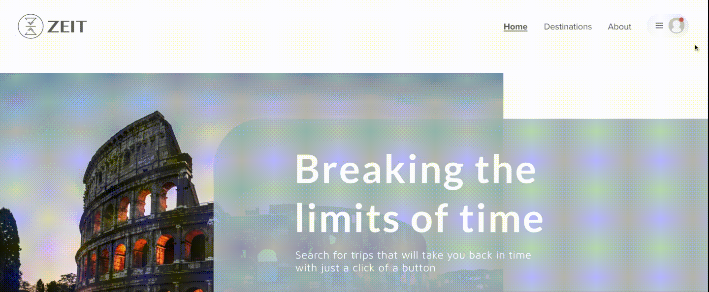
Zeit
Time Travel
scroll
About
I was asked to design a website for a travel venture. Through research, UX best practices and User testing I created a responsive website that would tap into a new way of traveling.
Task
With a total of 289 destinations around the world Zeit has created a safe and secure way to travel back in time to controlled and protected areas. Features like allowing travelers to access attractions and nearby cities with groups makes trips unforgettable. Zeit is the first company to sell time travel packages.
Background
01
About
I was asked to design a website for a travel venture. Through research, UX best practices and User testing I created a responsive website that would tap into a new way of traveling.
Request
With a total of 289 destinations around the world Zeit has created a safe and secure way to travel back in time to controlled and protected areas. Features like allowing travelers to access attractions and nearby cities with groups makes trips unforgettable. Zeit is the first company to sell time travel packages.
Background
01
Deliverables
UX | Responsive Website
Book travel
Easy to navigate
Simple
02
UI | Rebrand

Trustworthy
Vivid Imagery
Simple
Research
03
Competitor Analysis
Method
-
Research 5 travel websites
-
Analyze strengths, weaknesses and target personas
Findings
-
Other Travel websites often take user to an outside source to book.
-
Several steps when needed to complete booking and AD popups are prevalent throughout sites.
-
Little to no upfront and honest pricing

The image above represents the 5 competitors used for the competitive analysis. 3 (SpaceX, Trip Advisor and Expedia) are Zeit's direct competitors and 2 ( Google flights and The Boring Company) are indirect competitors
Card Sorting
Method
-
6 participants
-
20 cards
-
Open sort
Findings
-
5 out of 6 people categorized the cards into sub-categories
-
Place > Continent
-
-
4 out of 6 people categorized by verb i.e. doing, watching, building
-
4 out of 6 people viewed cards by Moments in history

This chart show strong pairing cards and potential groupings. For each pair of cards, the intersecting cell shows the percentage of participants who grouped these cards together.
User Interviews
Method
-
4 participants
-
Late 20s - Early 50s
-
Have used travel website before
-
What do they like/dislike about their experience?
-
General Habits:
-
how often they travel
-
why they travel
-
What makes them want to travel
-
Findings
-
4 out of 4 participants said that they would prefer to keep to themselves
-
4 out of 4 participants expressed the process of booking travel as frustrating
-
4 out of 4 participants said they struggle with trust
-
4 out of 4 said that the reason they travel is to escape in some aspect.

Above is the compiled notes with final conclusion found during the interview process
Define
04
Empathy Map
Method
Created by Dave Gray as a collaborative tool, an empathy map is used to gain deeper insight into their customers. Much like a user persona, an empathy map can represent a group of users, such as a customer segment. I took my interview notes and broke down ever comment into doing, think & feeling, seeing, hearing, pains and gains.
Findings
Doing and thinking & feeling were the most spoken for. Users wanted fluid booking site with less pain points while booking trips that allows them to be safe and experience new things.

Persona
To create the persona, I meshed the goals of the business (middle agers) as well as common information found throughout the user interviews.

Business and User Goal Analysis
Overlapping Goals
-
Easy to navigate
-
Secure checkout
-
Responsive website

Design
05
Site Map
A site map is a list of pages of a web site within a domain. Pages that I found were important were an account page, book a trip page, about page, support page, destination page and a sign up/ login page

Task Flow
Based on my user persona i created a task flow reflecting the flow Mike would perform to book a trip.

User Flow
A user flow is a map of how users can move through the product to accomplish their goals. It outlines all possible scenarios, options, errors, dependencies, and outcomes. It also takes into account Persona needs and context. The flow below is how I perceived the user would move through Zeit.

Sketches
These sketches are the base of the final product. They focused on what the user needed. I sketch out some rough low -fidelity wireframes which you can view below.

%20(1).png)

%20(1).png)
Wireframes
Framework of the website. Layout all the necessary components that were gathered throughout the research and testing process.

High Fidelity Wireframes
After creating an initial wireframe which got approved. We moved onto creating a high-fidelity wireframe which included adding the color theme, images, and text.

UI Kit
When creating the UI kit I chose a calming palette with blues and tans and an sharp and bold orange to give it a pop. The typeface Myanmar MN is modern yet adventurous.
The logo itself represents a change in time with two open deltas looking like an hour glass.

Prototyping
For this prototype I focused on Mike's main flow of booking a trip and signing up for a newsletter. Hover, active, and loading states were included to make sure this higher fidelity prototype felt real to the testers.
Test
06
Usability Testing
Method
-
Moderated
-
4 participants
-
Late 20s - Early 50s
-
Have or have not used a travel website before
-
Key Findings
-
Participants could easily navigate through the website and complete task.
-
Search method presented more difficult as it didn't stand out to catch participants eye.
-
Clear and vivd imagery was visually appealing to participants.
-
Participants like that you could share your trip

Affinity Map
Method
An affinity map helps designers sort, prioritize, and rank our user testing feedback
Participants comments were divided by fundamental elements.

Take Aways
06
Summary
This project allowed me to learn the power of a simple yet effective design and the process of design itself. Hearing from research participants as they shared their frustrations with other travel websites gave me the ability to purposefully and intentionally design a product that met their needs.
I found that user research was my most valuable asset as it brought up unexpected areas to explore as I was planning my product design. I realized through this process that taking time to ensure your data is sufficient and purposeful is critical and going back to redo research to ensure accuracy is pivotal in this process. Every user study (which ended up being over 12 individuals) helped me make Zeit.
Next Steps
-
Implement priority iterations:
-
Move newsletter further up the page
-
Adjust search bar to allow for users to move in any order (not just chronologically)
-
Add titles to filter section on Trip Destination page
-
Remove extra click for calendar on the detailed destination page
-
Checkout: disable buttons till they have fully completed section
-
-
Areas to consider for the future:
-
Design and Test chat bot to answers users questions within seconds
-
Plan usability tests for search bar/filter
-